

Liquid Glass: The New Design Language That’s Melting Minds (and Interfaces) Across the Internet


Drive growth with the best strategy partner in the game.
Schedule a ConsultLiquid Glass: The New Design Language That’s Melting Minds (and Interfaces) Across the Internet
At this year’s Worldwide Developers Conference (WWDC), Apple dropped a design bomb that made designers drool and skeptics give the side-eye: Liquid Glass. This isn’t your usual “we nudged some icons around” update. It’s more like, “What if your phone’s interface behaved like actual liquid mercury that somehow went to art school?" And perhaps unsurprisingly, the internet's having a moment with this.
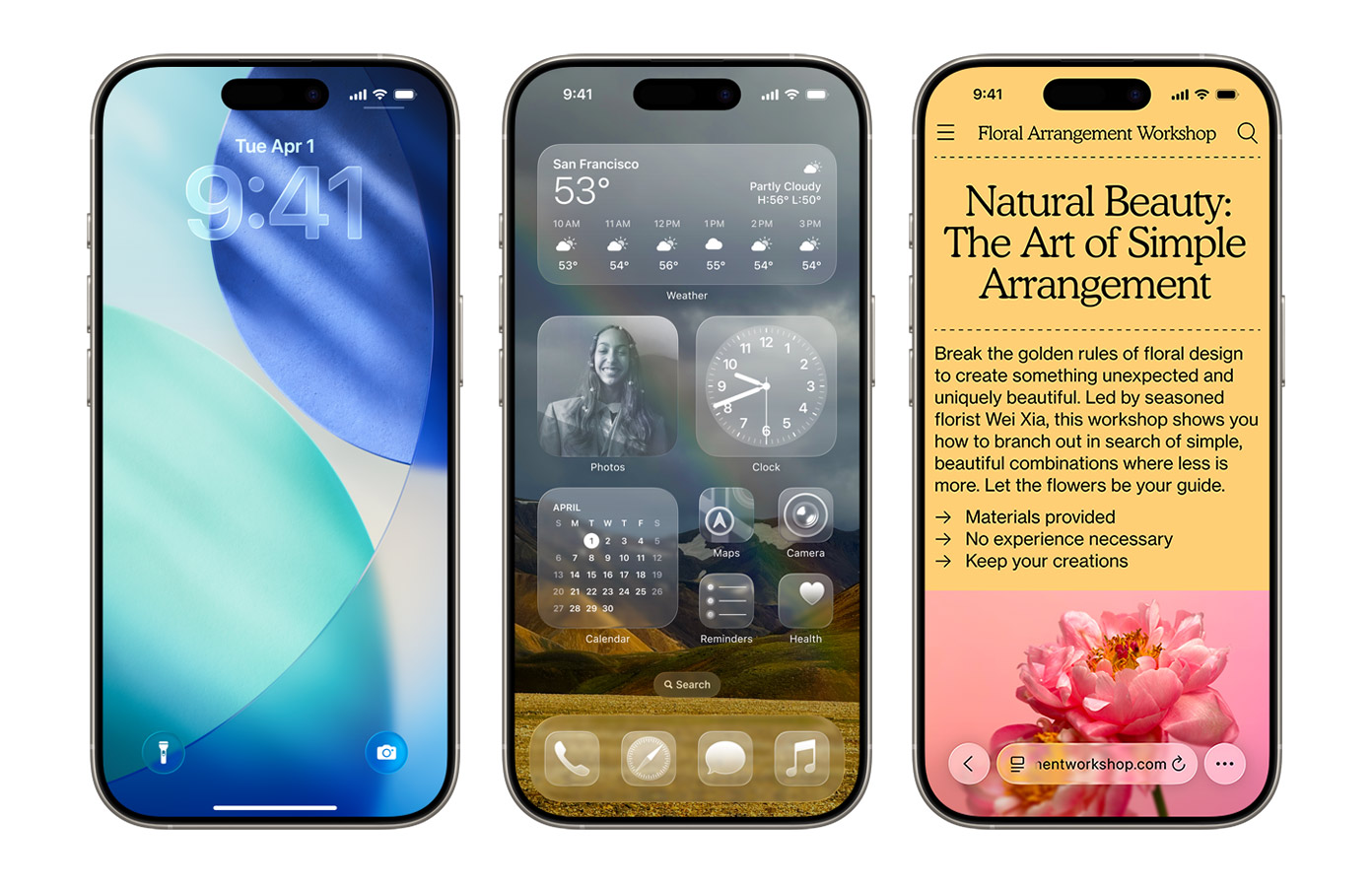
Liquid Glass is Apple’s new design language—shiny, shapeshifting, and very “ooo, ahhh”. Debuting in iOS 26, it turns static screens into translucent, responsive, light-bending surfaces that adapt and react in real time. It’s a dramatic leap from the clean minimalism of iOS 7 into something far more…futuristic: a UI that looks alive and feels emotionally intelligent.
SOURCE: https://www.apple.com/os/ios/
Part UI, part fever dream, with the launch of Liquid Glass we’ve officially left the flatlands and entered the era of interfaces with feelings. Looks like Apple is betting that the future of UX lies in tech that behaves less like a tool and more like a conversation partner (with really great lighting).
So, is this the future of UI? In this one, we’re unpacking what happens when Cupertino tries to reinvent how digital feels and what it means for every brand trying to make their own digital experience a little less forgettable.
Let’s go.
Where Liquid Glass Gleams
1. New Look, No Learning Curve
With Liquid Glass, Apple pulled off something uniquely special (and frankly, downright genius): introducing a radically new visual system without breaking user expectations. Liquid Glass might look like it’s been piped in from a sci-fi trailer, but the way you use it? Still classic Apple.
The underlying interaction model hasn’t changed. Buttons behave like buttons, swipes still swipe. It’s all about surface-level reimagination layered over deep usability. For users, that means zero learning curve. For designers, it’s a masterclass lesson in how to evolve boldly without alienating your base. That’s UX at its best, from the best in the biz: new skin, same bones, zero confusion.
2. UI That Wears the Brand Without the Logo
You know Liquid Glass when you see it. That’s the point. It’s not just a look, it’s a visual signature that screams “Apple” without needing a logo. From the texture of the blur to the fluidity of the light, every layer is deliberately ownable.
That’s what makes this a branding masterstroke. Anyone could’ve played with glassy effects. But Apple didn’t just chase style, they defined a system (yet again) with UI that is as much a marketing asset as it is a usability layer.
For brands watching, the lesson is clear: if your interface looks like everyone else’s, it doesn’t matter how well it works. That’s why our web design team builds brand-first, conversion-smart experiences that do more than just look pretty.
3. Touch Without Tapping
One of the most quietly brilliant things about Liquid Glass is how physical it feels, without a single buzz, click, or vibration. Gone are the iconic iPhone haptics we all remember.
Buttons don’t just sit on the screen anymore. They respond. Light bends around their edges. Surfaces ripple with dimension. Depth seems to breathe. And in that illusion of tactility, something remarkable happens: your brain buys it.
It’s invisible genius, a sleight of hand, a sensory trick that turns pixels into presence. You tap, and instead of haptic feedback, the interface answers with motion, with light, with visual confirmation so intuitive it feels physical. It’s action, completion, and satisfaction, all delivered through sight.
But here’s the bigger picture. In a world rapidly moving toward augmented reality, spatial computing, and ambient interfaces, touch won’t always be an option. Screens are dissolving. Clicks are giving way to gestures. The line between device and environment is blurring.
Liquid Glass is a prototype of that future. A first glimpse into interfaces designed to be felt without being touched, where motion, light, and instinct replace buttons and labels. It proves that in the next era of interaction, movement isn’t just for show. It’s a language. This update is about teaching us to trust what we can’t physically touch.
Where Liquid Glass Starts to Crack
1. Contrast Gets Complicated
Transparency may look sleek in a demo, but even the prettiest panes can chip under pressure. Liquid Glass assumes a clean, curated background that complements its glow. But real users don’t operate in art-directed environments. They use chaotic wallpapers. They multitask across visually dense apps. They navigate digital spaces full of competing elements. And in those contexts, contrast starts to collapse and usability takes a hit. Text becomes harder to read. Icons lose definition. Interactive elements blur into the background. All that fluid motion? Starts to feel more like a design meltdown.
When clarity depends on variables you can’t control, like user customization, ambient content, or unpredictable third-party visuals, the interface stops being adaptive and starts becoming fragile. For design to scale, it must remain resilient in imperfect real-world conditions with real users, not just beautiful in the best-case scenario.
2. Accessibility Isn’t a Setting. It’s a Standard.
Okay, it’s beautiful, yes. But for users with motion sensitivity, low vision, or cognitive processing differences, Liquid Glass can feel like a haunted house of motion and blur. Animations that feel fun and engaging to one person might be dizzying, or even downright unusable, to another.
Apple’s accessibility settings help, but that’s reactive design, not inclusive design. Brands should think about accessibility as a baseline, not an afterthought. If your core experience excludes even a fraction of your users, no amount of futuristic flair will redeem it.
3. Tap Targets and Blur: A Love-Hate Story
When you blur an entire interface, you risk blurring interaction cues. Users may pause, confused about what’s tappable and what’s decorative. Good UX is obvious. Liquid Glass, while beautiful, sometimes flirts with ambiguity at the cost of speed. It’s a cautionary tale in the tension between visual innovation and interaction clarity.
Aesthetics should never compete with function in UX/UI, especially when users decisions are made in seconds. Because not every screen wants to be a stage. Some just want to get the job done. Digital product designers and marketers, take note: your UI should never make users squint to find the action. Especially in B2B, that moment of friction can cost you the click, and the conversion.
What B2B Brands Can Steal from Apple’s Shiny New Toy
If you’re thinking, “Cool for Apple, but how does this apply to me?”—listen close:
Design that moves people moves metrics.
Liquid Glass makes a compelling case for both sides of the conversation. It’s both high-concept and human-centered. It layers modern interaction logic with visual fluidity to create something rare: an experience that obeys the rules while reinventing the medium.
Apple, to its credit, isn’t treating this as a finished product. With Beta 2, they’re already refining the UI, gathering feedback, and iterating in real time. It’s a reminder that even the most elegant systems need to evolve, especially when you’re designing for both emotional resonance and everyday usability.
But luckily you don’t need Apple’s budget to apply these principles. You just need a partner who understands how to build experiences that feel alive.
At ROI·DNA, we’re already helping brands create UX that breathes, speaks, and glows. Want to build something that’s more than functional—something, dare we say, fluid?
Let’s build something that doesn’t just convert.
Let’s build something that moves.
Let’s talk →
P.S. If you haven’t seen Liquid Glass in action yet, do yourself a favor and feast your eyes:
-
 Ananya Kumar


